Wednesday, December 15, 2010

wedding magazine

What happens when a wedding bouquet of flowers is no longer a bouquet of flowers but a bouquet of butterflies?
Design happens.
Changing how people perceive objects is what I as a designer hope to do. When I saw this bouquet I was taken-aback because I had never thought of a bouquet of flowers as being able to be anything other than that, a bouquet of flowers. 


Sunday, November 28, 2010

Design is Dangerous


Sometimes designers cannot predict if their design will be used in the proper manner or if it will be dangerous for certain people. When the fireplace was designed inside a home many people thought it was a brilliant idea and didn’t think that it would end up burning down houses and killing people. Design can be brilliant and do exactly what it was made to do and at the same time be a danger or hazard for people. Sometimes this causes the design to be taken off the market or redesigned to be safer. The fireplace has been around for decades but as time progressed the design has changed from a open area with a chimney that takes the smoke out of the house to an enclosed area that is sealed to keep the sparks from escaping to a fireplace that is “fake” and where the heat is actually gas like a heater and not really a fire because it is safer. The fireplace is a great example of how a design can morph and change from something dangerous to something safer for the public. 

Design in Society: Net Zero Waste


Wouldn’t it be nice if everything had a net zero waste? Moving towards designs that incorporate this aspect is what everyone should do. There are many big designers, landscape architects and architects who are designing buildings, houses, objects and cities so that there is little to zero waste produced. At the University of California Davis the Whole Earth Festival is a net zero waste event and Picnic Day will follow soon. They are also one of the few college campuses moving towards a net zero waste campus.

Have net zero waste is not the same as being self-sustaining. Self-sustaining for a building means the building creates all of the energy consumed, for lights and appliances, uses only water from on site and produces food onsite. This could mean using solar panels or photovoltaic cells, wind turbines, rainwater catchment systems and having community gardens usually on the rooftop. Green roofs and rooftop gardens help insulate the building, which reduces the amount of heating and cooling buildings need. Net zero waste is where an event, object or site uses products made off site but has little to no waste after using them. This can be getting food off site but then composting what is not used or only using products made with biodegradable or compostable materials.

Designers are moving more towards designing with sustainability in mind. Keeping the terms Net Zero Waste and Self-sustaining in mind will help get these concepts out into the world of design. Sustainability and designing to better society does not have to be this outlandish idea with solar panels and green roofs it can start with using a compostable plate instead of a Styrofoam plate. 

Color Transforms


Would a stop sign still have the same meaning if it weren’t red?
Imagine driving down a road and you see this but it is black instead of red. Does it still mean stop to you? Or does it mean something else?  Now think about if this were in another language. 
Having the sign be in red helps identify that this is a stop sign to people who may not be able to read the sign. If this were black like the sign above the message may not be clear to everyone. Having the sign be red not only in one part of the world but also across the world helps make the design successful. Without the color of the stop sign the stop sign is not as powerful of a design. It just becomes another street sign. This is an example of how color helps transform the design from being adequate to something that is identifiable worldwide. For many designs such as a car or bicycle the color does not help distinguish the design and how effective it is, it just enhances the aesthetic value of the object. If looking at a the color of the pipes to distinguish what pipe has waste water versus clean filtered water color plays a huge factor in the design. For most designs color is just a component of the aesthetics but for some designs it determines if it is effective or not. The most effective aspect of the stop sign is not the word stop but the red association with the word stop. 

Monday, November 15, 2010

Thermostat

The design of a thermostat used to be a single circle where you could turn the dial to heat or cool. Sometime it evolved to be a square with lots of buttons and to change temperature to heat or cool it takes reading a manual to do. When did the design of this simple device become so complicated? The thermostat controls all of this energy and controls how we feel, warm or cold, so why did we make it so complicated?


Using the thermostat that is electronic can be so confusing to the point that a person will go cold because they can not figure out how to use the device. Why is the thermostat so complex in this day and age? Why did we change what was working for something that many people don’t understand or don’t know how to use? Many older people prefer the simpler thermostat because they can read it, they don’t have to figure out the combination of buttons that will make their house warm or cold and they don’t have to worry about if the heat or ac will be on unnecessarily because they cant figure out how to use the device. It is not only older people that think this way but younger people as well. Why as well get so much more advance with technology do we have to make it so much more confusing or difficult for people?


Society needs to stand up and say we like it how it is! It is not a bad thing to keep things the way they are if people like them or think they work well. People want to change everything so that they have the newest version but this is making it so that we have all this waste because things are not designed to last. Designers need to take a step back and start looking at what works and how we can continue to design for things to last and how we do it sustainably. How we are designing now isn’t working and there are great examples of designs from the past that work and still work to this day.

Bus Stop

When people think about ergonomics the first thing that typically comes to mind is a person sitting at their desk working on the computer; how the chair, keyboard and mouse work with the person. Ergonomics are not just for the office but for every day objects as well.


Bus stops are a perfect environment for ergonomics because many people use them, they can be put in different places and can have many uses. The 5 elements that characterize ergonomic studies are safety, comfort, ease of use, performance and aesthetics. The safety of any bus stop can incorporate the surrounding area, the space the bus stop creates and how the pedestrians feel at the bus stop. This is an example of a bus stop that does not incorporate safety.


Lighting, seating and covering are elements that can be part of the safety of a bus stop. If there is adequate lighting, seating and a “shelter” such as image below the bus stop can be considered safe. Another component is the proximity to the moving traffic. If the bus stop is right along a very busy multi-lane street it may not be a safe environment for everyone. Adding a vegetation barrier from the bus stop to the moving cars would help make it safer.


Along with safety comes comfort. How comfortable do the pedestrians feel while at the bus stop? This can be many emotions such as happiness, comfort, and perceived safety. The comfort is driven by how safe the person is and how safe they feel within the bus stop. Comfort also takes into account the comfort in using the area. If the bus stop is not actually comfortable to sit in then people are less likely to use it. If the bus stop is constantly dirty, smells or doesn’t have shade cover then it is less desirable. 
Ease of use will determine if the bus stop is accessible for all different types of users. This means that it has to be accessible for youth, teenagers, adults, families, elderly and people with limited mobility. Ease of use doesn’t just incorporate the bus stop but also how easy it is to get to the bus stop from the surrounding area. Are there stairs and no ramp? Is there a crosswalk so people from the adjacent side of the street can get to the bus stop? If there is a slope to the streets is it accessible for people in wheelchairs? All of these factors need to be considered when looking at the ease of use.


 Performance for a bus stop is not the biggest aspect to look at because the bus stop doesn’t perform in the common context of ergonomics. The performance of the bus stop pretty much is the use. Do people of all types use the bus stop? If so then the performance of the bus stop is good.


Aesthetics can determine if the bus stop will be used or not. Bus stops have the opportunity to entice people into using the alternative transportation by how they look. This bus stop has character and makes the people want to use the bus. Aesthetically all bus stops can have different qualities which can make them work better. Some very strong bus stops are ones that incorporate art, and the community that they are placed in. If each bus stop were designed by a local artist and specific to the area it would bring the community together. Doing this would make it so that it is not just a bus stop but also a community art piece. This takes the aesthetics to a whole new level.  The aesthetic aspect of ergonomics really depends on what the item is, where it will be and who will be using it.


Safety, comfort, ease of use, performance and aesthetics are all part of ergonomics and can be applied to everyday objects such as a bus stop. What you incorporate into the ergonomics can affect many people or just one.

Monday, November 8, 2010

Design of Society

The design of our roads and circulation can dictate how we feel, behave and perceive our surrounds. People enjoy different types of scales at different times in their lives, days or moods. Some prefer a larger more dense scale to their surroundings like urban or large city. Others prefer a smaller less dense environment like a small, rural environment. The design of the streets in each scale can really dictate how the person feels and can make it a more enjoyable place to be. 

Many people do not think about the fact that what you see when exiting a building is a designed space. We as people today do not realize that we have a say in the environments we reside in and the buildings and objects we use. We should be upset and complaining when something doesn't work or we don't feel safe in yet no one says anything. People really need to think about the spaces and objects that are the basis of our society and how we can change them to better suit our needs. 

Thinking about all the objects we use a day and all of the different spaces we occupy throughout the day can make a person realize just how much of our society is designed. You can look throughout history at the different styles societies have gone through in the design of their surroundings. Knowing this why are we not complaining to the people who are designing to try something different and to attempt something that might be better than it is. With all of the history it gives the designers lots of material to work from and then go on to make something better yet designers are not getting any better than they are but in my opinion worse. I dont think that it is completely the designers faults because now a days there are different constraints than before such as environmental factors. But having said that the designers should know certain specifics such as lighting at night, sidewalks for pedestrians, chairs that people are comfortable sitting in and objects that are usable for longer than a few months. 

People need to start standing up for their environments, spaces and objects that shape their society so that they are better suited for everyone and better for the earth. Start by doing something when an object doesnt work, or you feel unsafe in an area. Talk about it with other people or go to community meetings. There are lots of ways everyday people can be involved in the design of their society and I say act now!

Words and Images

Can the shape, color and design of the words make a difference in the meaning of the words or the message of the words? Many people spend meticulous time debating and worrying about these components with words. This is an example of how the design of the words can make a difference in the effect of the message. 
This poem could have gotten the message across without the shape of the words but it is much more effective with the shape because not only are you reading the words but also seeing the words. There are more examples of this concept and it can be very effective use of images with words in a more obvious way than others.


This type of imagery is rather effective in comics, children's books and poetry because most of those are suppose to be more words than images. Poets for years have been composing their poems in images to convey the overlying story of their writing. The image above illustrates the man in the poem so the reader will be thinking about the man throughout the poem. This can also be an effective way of subtly pointing out something that may not be as obvious in the text. This would be a great example of how words and images use each other to portray ideas that may be hidden without the help of the other. 

Words and Images

Photo Credit: kh2rac 
To Write Love On Her Arms

         A picture is worth a thousand words, so what is an image with words? 

Words and images can portray a very powerful message to the viewer or just create something that is funny.

There is a balance between words and images. Sometimes they can enhance the image and other times they can over power the image. The subject or message of the graphic can dictate the proportion of words to images and vice versa. Presentations and articles need more words than images and if there are not enough words the message does not always come across. When giving a presentation there are common rules to the balance of words and images such as there should be an image for every paragraph or few lines of words and that there should be more images than words so the reader does not get bored. Everyone has their own style in this format but knowing the proportion of words to images can be the deciding factor to the success of your message getting across to your audience. 
Graphics that are more for advertising, posters, album covers and an assortment of others should have more images than words or the words should come secondary if doing one single images. 
The image above is an example of a good image to word ratio for an advertisement. The image for these is where the most information is going to be taken and if there are too many words the viewer may walk away before understanding the message. If there are no words at all though then the message may be left up to too much of an interpretation by the viewer. 
These are just two examples of the word to image ratio used in our day to day life. There are many others to explore and figure out what ratio you prefer.


West Side Story


The Jets and the Sharks! 

Monday, November 1, 2010

Objectified

The movie objectified took everyday objects and made the viewer look at the actual function and compare it to the form and aesthetics. The movie started out with a person waking up in the morning and showing all of the objects that person uses. It make it so apparent that design is everywhere and how many people don't even realize what actually is designed. 
For many consumers everyday objects are just there and they don't think twice about it. Many don't even put together that when shopping you are comparing all of the designed objects and choosing which object you think is going to function better or which you like for purely aesthetic qualities. A designer in the video brought up a good point and about how consumers have all of these options yet are not in an up roar when something doesn't work. He said there should be a riot when the function doesn't meet the need. There were many other great points in the video such as the sustainability side of design but content and form were two hey roles in the movie. They also touched on how designers can use the form to change the contents perception It was brought up the ides to form not following function so the viewer has to really figure out what the object is and about. 

Umbrellas

Rain, sleet, hail and thunder mean it is time for an umbrella. Once the rain hits umbrellas because the topic of choice, with what type do you have, pattern, size or effectiveness.


 Everyone is always comparing these mass produced object to see if they have the best or the umbrella they feel is the coolest. The quality of the umbrella itself can have different weights, textures and a variety of elements. Some have thicker material and heavier metal to pop open and withstand the wind. Others are smaller and flimsier so they can collapse into almost nothing. After element can be the size, first the span of the umbrella, second how small it is when folded up. The pattern and design of the umbrella is purely for aesthetic reasons and can be the main driving force to why someone would pick that umbrella. Looking at scale and how it can be played with to create different scenarios such as an umbrella for two, for children, or for full coverage. Scale can create a whole line of umbrellas for a company where maybe they specialize in childrens umbrellas. All the different elements can be manipulate or used to create an identity of the company making them or the person buying it. Scale, texture, pattern, shape, weight and size can become the focal part of the umbrella or all of them can be incorporated. 

The Central Valley, A California Landscape

When reading this title what comes to mind? Really, think about it. Agriculture? Cities? State Capital? Analyzing what is the identity of the central valley there has to be considerations of the identity in which people perceive it. Can a model with a river, crop rows and mountains be identified as the central valley? What if the mountains were metal, the crop rows in the air and the river made of mirrors?
The perceived notion of what an object plays a large role in design. When people know what the object is the message can be read by many people. The job of the designer is to figure out what people perceive an object as and how they can manipulate the objects to get there specific message across. 
Going back to the central valley and talking about how people identify objects with tasks or places can work for or against the designers. We could ignore the perceived notions and chance our message not getting across or go along with the image and use it. A good designer will take into consideration the perceived notion and use it as a resource for design.
Manipulating the objects to tell a story or show an aspect of that object that is over looked can change peoples outlook and make a significant difference, or just make someone laugh.

Monday, October 18, 2010

One Balloon


Round. Transparent. Shiny. Colorful. Delicate. Light. 
Happiness. Pleasure. Joy. Fear. Want. Desire. Freedom.  Smile.
Obstacles. Rolling. Air. Group. Color. Playfulness. Childhood. 


Attributes.
Feelings.
Inspirations.


All of these attributes, feelings and design inspirations come from this balloon.

Sometimes the simplest idea is the best.

Balloons inspire me to look at everyday objects and incorporate them into how I think of design. Stringing words together to make an idea using everyday objects around one may be all the inspiration one needs. Now some may be saying, “duh stringing words together is called thinking and writing”, but this simple act of writing this very idea down has inspired me to design a space based on these attributes, feelings and inspirations. Keeping these in mind and referencing them later on helps them actually be incorporated. It doesn’t matter how good someone’s memory is it is always a good idea to write these inspiration items down, no matter how insignificant they may be, because they could be gone by the time you are done writing. Most of the best writing is spoken out loud and unless it is written down only the people or person hearing it have the privilege of knowing it.
Lately people are more materialistic and ideas have to be on a grand scale so I have decided to think about the smaller things and how they can be incorporated into design.

So what is your inspiration? Is it in a small-scale object like a balloon? or a large-scale object such as a city?


Compare and Contrast

                                                  Content vs. Form

                                   Scott McCloud Understand Comics
Every designer struggles with content and form and how to balance the two together. If the main focus is the content without thinking about the form the message might be lost or misconstrued to the reader. It also does not matter how great the form is if there is no content. Finding the balance is the ultimate goal of designers, or at least I think it is, no matter how minuscule the object or design may be. When first designing or brainstorming content is most important so the point and message are established but form cannot be forgotten. When form is not thought of until the end the content may not fit or it may not go together with the page size or parameters that may be there in the end.Many people do not take into consideration the time and the importance of form. This is an example of when a powerpoint presentation that has too many words and overwhelms the reader.
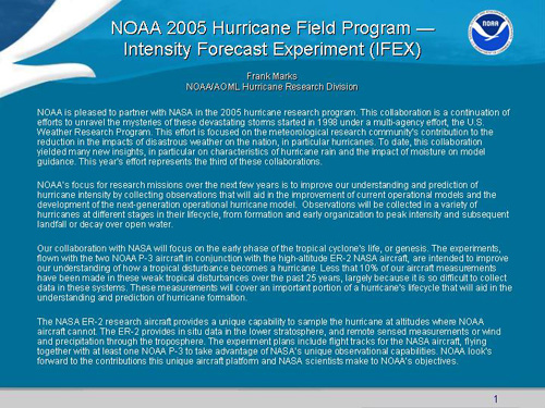
                                                          Frank Marks, Jr Presentation
The content is there and there was some thought as to the form but they didn’t take into account the amount of words to images or negative space. 
This is an example of a slide where form takes over and there is not enough content.
For me Form and Content go hand in hand and have to be analyzed every step of the design no matter if it is a caption of an image or the final installment of an art exhibit.

Design as Conversation

A billboard, a street sign, a menu, a street, a car , a phone are all objects that are designed with words, icons and images.
Is design a conversation? or is a conversation just with words?
In everyday life the objects around us guide our conversations. Most don't think about a conversation and how it pertains to design. Not only are the objects designed but the placement of these objects, buildings and landscapes are designed as well.
So a better question to ask is when is design not a conversation?
I am not saying that design is everything but that design incorporates everything. So when conversing you may not even realize that you are talking about design.
Designers of all genres create conversations with their designs ranging from a statement about sustainability to the violation of a women like Yoko Ono's 'Cut Piece' to the simplicity of a writing implement. For me the term designer incorporates a wide variety of disciplines.

To go back to the question is conversation only with words, if this is correct then how are words incorporated in design? The common phrase is a picture is worth a thousand words but I think an affective design that is a conversation is an image, icon and design that can effectively incorporate the written word. These images to me are examples of designs that can be considered conversation. There are so many more components to this discussion of design as conversation that designers are exploring as you read this.
Now it is our turn to find our way of designing that effectively uses images, icons and words to create conversation through our designs.

Monday, October 11, 2010

People Designing Landscapes

After a landscape is designed it is most of the time changed and re-designed by the people who use the landscape. People do this to landscapes that are natural and not man made. An example of what I mean are natural trails like this.
After a landscape is designed it is most of the time changed and re-designed by the people who use the landscape. People do this to landscapes that are natural and not man made. An example of what I mean are natural trails like this.  These were not designed in the sense of thought out in a drawing and deliberately made by designers, these were designed by the people who use that landscape. Are the people who use the landscape and create these designers?I do not know the answer to this, it is whatever you want to think but I will show you some examples of Landscape Architects who use the people as the designers. A landscape architect had the students on campus for a year carve where they wanted the paths to go. After the year was done there were distinct paths that people took to and from class and those were the paths the Landscape Architect made the paths for that courtyard. Another form of everyday people designing the landscape is guerrilla art where artists add their own artwork to the design like this
 or this 
 For me graffiti is another example of guerrilla art that someone draws to help design the landscape.
These are a few examples I have found of people helping to design the landscape and as a landscape architect major I am finding out more and more how important it is to use the people as designers not just myself.

Creativity From Without

Finding creativity from without is to me a form of inspiration. Looking outside of ones self to find creativity to me is essential. Landscape designs are incorporating the spaces you occupy and thinking about how it affects the people using the space. Finding creativity from the people, things and spaces is what landscape design is all about. Peter Donnelly is an example of an artist who finds creativity in his medium, the sand, and trusting it to show him the right way.
Work By Peter Donnelly
We performs art at the pier using the sand specifically brighton sand which is volcanic. The stick he uses relates to a pencil, the rake is like a brush and the shells symbolize beauty. His artwork is using the space and objects around him. He says the pier is a healing place and that he uses that to shape his piece of art that day. When he works he makes references to the place and space itself saying it has to be done in it's time. He says that the pieces of art are not suppose to last they are suppose to be born and then die and he isnt the one that decides this but the space and environment do. 
Work By Peter Donnelly

Peter Donnelly is not the only artist who draws from the environment he is in for his art. Goldsworthy is an artist who is famous for art that is only there for as long as nature will allow. These two artists to me are very similar even though they have different mediums and styles. They both look outside of themselves and look at the environment their in for inspiration and creativity. Work By Goldsworthy

Stone Soup

There is a childrens book written by Marcia Brown called Stone Soup.

The concept of Stone Soup is to have everyone bring in items that they may have just lying around to contribute to this communal "Stone Soup". This is typically done in kindergarden classes to teach the children how to share but it can be applied to any situation like a introduction design class in college. My design 1 class at UC Davis had a stone soup day where we broke into groups of around 8 people and built a piece of art with random objects everyone brought. Using the concept of stone soup, where each person brought a piece of food to add to the stone soup we brought objects that we thought would be nice to make into an art piece. 
My group started by putting the objects in a pile and having everyone start assembling together. We didn't really talk about a design but changed it as we went. This was a very different approach that other groups. When we started to put everything together it was a different design approach that I normally do but it was nice to try something new. After looking at everyones Stone Soups I wished we had talked and come up with a design first. 
The design process of sketching and talking through the design is more my style than just doing. It was a good exercise and I learned a lot about the different styles of design. Something I observed when looking around at all of the stone soups was that each group didn't use every single object that they brought.  In art and design negative space is very powerful and many people forget about this object. This art piece uses negative space well, where the designers thought about the piece and didn't fill every space. 
By Sarah Smith
At the end of the class I was sad to see the art come down because it was a good demonstration of design and art using every day objects. I learned about designing with every day objects and materials and am now thinking differently about these when designing. This Stone Soup project has inspired me to start my own Stone Soup in my backyard to keep learning from this concept and experience. 

Monday, October 4, 2010

Is graffiti considered design?

Photo Credit: HabitForming

 Many people that I talk to don't consider graffiti to be anymore than someone tagging something. Would they think of it any different if that was drawn deliberately on a billboard and portrayed as a design?
 Graffiti can come in my shapes and forms, from tagging to murals. Most people do the designs or art with spray paint as there medium. I love the look of this medium on concrete and different building surfaces. To me they blend well together and many artists can get the texture they need for the drawing from the "canvas" they choose.

Who are the people that consider graffiti art? What is the differentiation of someone who tags to someone who is an artist?

I dont know the answer to these questions or if they already are answered but I know that graffiti is just another form of design and getting our messages across. Graffiti is known for how gangs choose to show their logo and design of their gang so does this make it not design? It is there logo, their design.

So how do we go about making people see this and that graffiti can be art and beautiful? For me I have always thought that people were using the architecture and their surroundings as their canvas and "typically" spray paint as their medium, so it was art! What makes it "graffiti"?


Photo Credit: Banksy
If you saw this but none of the surrounding building would you consider this art or "graffiti"?